Wednesday, August 3, 2011

Take me for a picnic

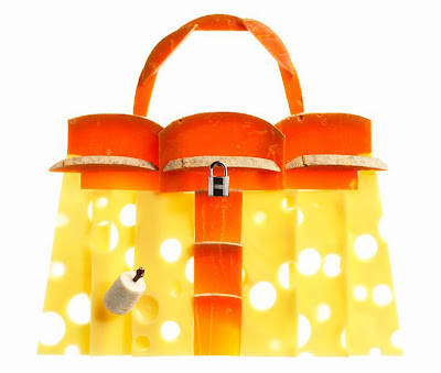
The Hermes Kelly bag recently got reincarnated into a picnic bag complete with woven wicker. But nevermind the bag. We are not here to gaze at that, but if you so wish:


Instead, what made me smile were the promotional photographs: the iconic silhouette of the bag frames all the delicious foods that would make a lovely picnic. It's fantastic. It's genius. I want them put together on a canvas and hung on a wall. I love it that much.


Thursday, July 7, 2011

Rediscovered

Love the moment when a once-beloved item tucked away in a corner reappears. It is like seeing it for the first time in the store, wearing it for the first time out; everything old is new again. Memories rush to the head and you are still the same emotional being. We forget, remember, relive.


Photographed by Sebastian Faena


Photographed by Sofia Sanchez &  Mauro Mongiello for New York Times, model is Amanda Norgaard


Photographed  by Tom Munro for Allure

Sunday, June 19, 2011

Back in Wonderland

For a long time I gave up on writing this blog. Partly because I was poor on time and partly because I don't like to put up things just for the sake of making another post. Today I decided it's time for a resurrection. I'll try to post more often and make it worth visiting regularly. If you like what you see but don't like checking often for new posts, you can always subscribe (to the right of this page).

NEW YORK, NEW YORK
(because no matter how hard I try, I can't get it out of my head)


Sunday, September 12, 2010

Tim Burton: the Exhibition

Today I finally visited the Tim Burton exhibition - a career retrospective of his works, published and unpublished. I am a big fan of his movies and his style. Tim Burton's works are dark and twisted: macabre, humorous, irreverent, tormented. The perspectives in his artworks are very exaggerated, the outlines of objects are messy and topsy-turvy. There is a little boy with nails stuck in his eyes and blood oozing out, there are two lovers 'enjoying' each other by feasting on their limbs, there is a poem about a girlfriend who's really a statue, and there are graveyards and stitched-up corpses aplenty. You feel small and isolated in a beautiful, curious version of hell.

I liked the rawness of his sketches/paintings. Most of them are roughly drawn; unpolished because they were not meant for public showing. His movies are very good, but they are so well honed that they often lose that unrestrained craziness. In his unpublished work, you see deeper into his mind. I was often surprised that some content was allowed to be displayed, but I'm glad it was (I think today's censorship goes too far and people need to get over themselves).

In many ways, Tim Burton reminds me of Roald Dahl, one of my favourite authors. In some of his younger work, he has a writing style very similar to Roald Dahl. But his adult work is much darker. These are a few of the displays that left a deep impression on me:


I love the colour, the concept. Probably my favourite.

You can tell he likes body "modifications".
Pumpkin-lined walkway leading up to an eerie ghost house. I'd love to stay overnight.
A hell of a room.

Definitely worth going. Give yourself at least two hours.

Thursday, September 2, 2010

My favourite things (and apologies)

First, I'd like to apologise for my absence from this blog. It's been four months or eternity in blog years. I hope I haven't disappeared into thin air. But in any case, I'm back and hope to post more often.

I thought I'd post a few of my favourite things: they're the little things that cheer me up, amuse me, something I can think about when I happily have nothing better to do. They are not big purchases, but rather things acquired on a whim 'just because'.

Recently, I've been getting into the whole aromatherapy/scent/fragrance business. I didn't used to pay much attention to scent, and I still don't think aromatherapy is all it's marketed to be. But sometimes, you come across something and it's like breathing in magic. Magic because you stop for a moment and imagine what it could be. It's quiet luxury:
Jo Malone Cologne. Very simple and wearable. This is not the complex, enigmatic perfume, which suits me just fine because I'm not the complex, enigmatic person. You could try layering different ones, but I prefer wearing one only. My favourite is the nectarine & honey blossom. I smell perfectly ripe nectarines in the warmth of summer. I don't mind smelling like fruit if it's delicious.


Aesop Resurrection Aromatique Hand Balm. Intense woody, herbal smell. What you smell in day spas. I bought a pump bottle when looking for something to keep in the bathroom. Due to my innate desire to match everything, I also bought a pump bottle of hand wash. Yes, I can hear you say, it's just hand cream and hand wash for god's sake! But favourite things need no justification.


Chanel Le Vernis - Paradoxal 509. I love nail polish. You can wear whatever colour and (usually) get away with it because it's such a small part of the body. Red nails say, I am fiery and passionate, even when the overall dress is conservative. This particular shade, paradoxal, is so beautiful. It's taupe/grey/purple depending on the light conditions - the colour changes, there is no way of describing it. It's really very elegant and moody, which is perfect for winter. In fact, I loved the entire Chanel fall 2010 makeup collection because it's exactly what I picture cold weather makeup to be.
Right now I am lusting after this pair of Chanel sunglasses. I saw it on Privilege. Read this blog if you have the time - it's beautiful prose written by a genuinely nice person. I don't know where I can get it or if it's even available here, but if I find it, I suspect I'll very likely cut off an arm and a leg to take it home with me. White sunglasses with pops of red and blue are too perfect.

So these are a few of my favourite things (to quote Sound of Music). They make the bad days bearable and the good days memorable.

Sunday, May 9, 2010

Kate Hudson is an everyday girl


Kate Hudson photographed by Peter Lindbergh for US Harper's Bazaar January 2010.

Kate H is fearless and she doesn't hold back - I like that about her. She's got this crazy joyful energy. You can see it in these photos. I love the idea of this photoshoot: dress a golden girl in OTT glamorous couture, and watch how she turns the mundane scenes of everyday life into something special. Something to keep in mind next time I do my grocery run.

Sunday, March 7, 2010

The continuing saga of the Lady Dior ad campaign

I posted awhile back about 'Bag Royalty'. I considered the Lady Dior bag to be one of the three timeless, investment bags. A few weeks ago, Dior started a massive ad campaign to promote the Lady Dior handbag. I'm guessing Dior wanted to revamp their image of prim ladylike couture to something a bit more edgy. The first installment of the campaign was a short film noir featuring  Marion Cotillard as Lady Noire. You can see it on youtube:


The film looked like it was going nowhere, and frankly, a bit pointless. I felt  it lacked any sort of real concept and only tied together some indulgent Dior imagery. But anyhow, I was interested to see where the next installment was heading.

The next installment, I knew, was going to be about Marion Cotillard as Lady Rouge. I expected another short film, but it turns out so far that it's just Marion Cotillard singing 'The eyes of Mars' by Franz Ferdinand. I received in my inbox today notification of the music video. You can see it on youtube or go directly to the Dior website.


I was sitting on the fence for the first installment, and this second one doesn't really change my feelings about it. The song is OK. Marion's voice is, of course, beautiful. But once again, the whole direction and concept of this very expensive ad campaign baffles me. Dialogue seems out of context, what has the song got to do with the bag, and most importantly, is this strange new image reflective of we love about Dior? You'll notice throughout the video, the Dior trademark cannage pattern stitching appears awkwardly superimposed on the eye, fades on and off in red leather stitching, and forms prison-like bars for Marion to hold onto. And I find this logo-marketing very forced and ineffective.

The epic, short film, big-budget ad campaigns started long ago with Chanel employing Nicole Kidman for marketing the Chanel No.5 perfume. We all remember that video. I loved that video. Beautiful music by Debussy, the breath-taking feather dress by Karl Lagerfeld, a very Baz Luhrmann storyline of star-crossed lovers and ultimately, it made sense. Perfume is about the sense of smell and the memories that it invokes in us. That video was about a common man who remembers his love affair with a tortured, untouchable celebrity by the perfume she used. It was all very romantic and sad.

But this Dior ad campaign, at least so far, seems lost on me. I love the handbag. It just seems like with all the money they've spent, the very talented actress, director, and photographer they've procured, that they could have done something spectacular with it. It's such a shame and I hope there's more to come that will change my mind.
Related Posts Plugin for WordPress, Blogger...